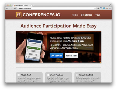
Conferences.IO Refreshes its Landing Site
When we launched the landing page for Conferences I/O, we wanted to experiment with a high-contrast dark theme. Most websites use designs with a dark text on a light background.
In terms of usability, both layouts are okay, though for people with poor vision, a high-contrast light-on-dark color scheme can be easier to read. Here’s an example of an accessible high-contrast layout. It’s simple but beautiful, isn’t it?
So we launched with a dark scheme, and we were fairly keen on how it looked, but we heard feedback from some of our advisors about the inversed colors.
Over the weekend, we reversed course and refreshed our landing site with the conventional dark-on-light. Let us know what you think.
